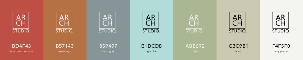
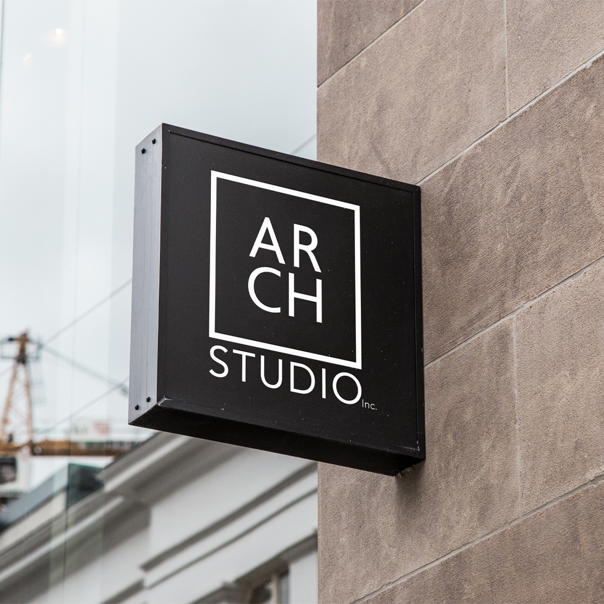
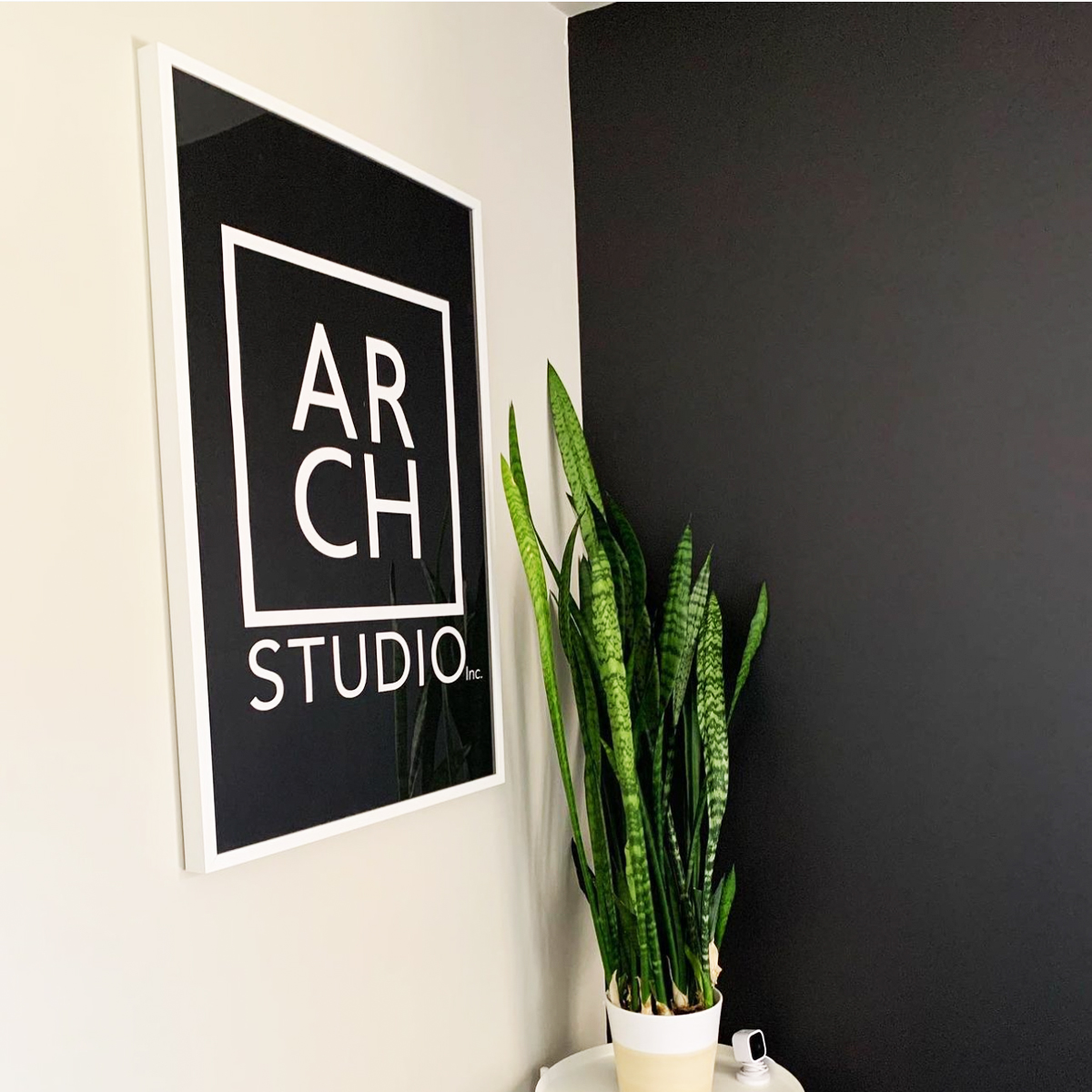
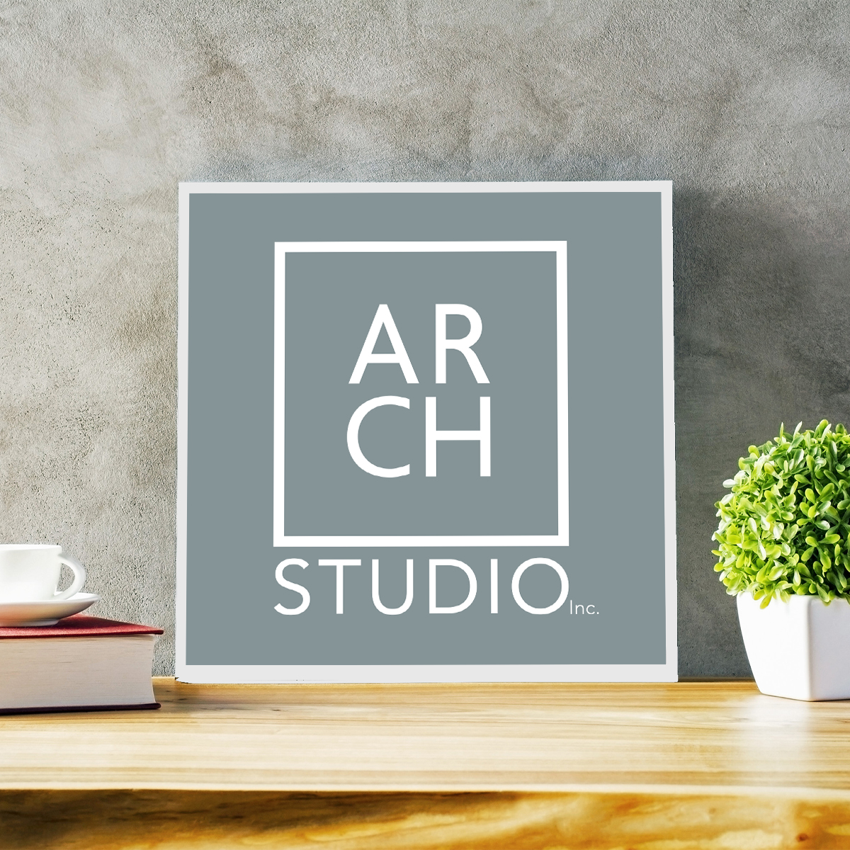
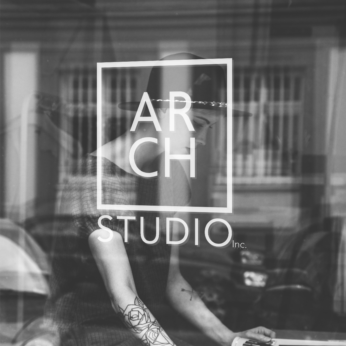
Encompassing a simple, balanced square logo, this mark symbolizes the clarity, growth and stability ARCH Studio has come to meet in this part of their journey. The clean logo is supported by a distinctive brand color palette system to be used as accent elements across marketing channels–from stationary and signage to construction banners–highlighting different facets of the company.
Following the initial rebrand, the identity was thoughtfully expanded to support Urban Home Studio, a ready-to-purchase house plan marketplace for urban and suburban lots. By adapting the original architectural shape of the primary logo, we created a cohesive extension of the ARCH Studio brand system– allowing room for continued growth and future branches under the ARCH Studio, Inc. identity and brand.