Pat & Jack: Cold-Press Juice
Branding & Design System
what even is cold-pressed juice?
ADOBE CREATIVE CLOUD:


Two friends. One kitchen. Shared vision.
BRAND STORY
Pat & Jack were introduced at just the right moment–two people with different backgrounds, but the same instinct to push simple ideas a little further. What started as casual chats and late night taste testing quickly became something much more.
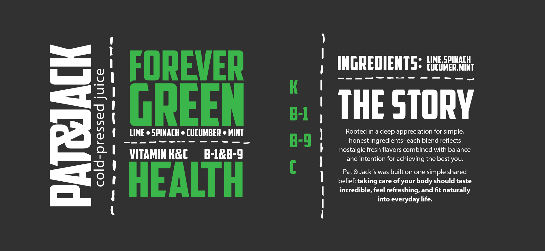
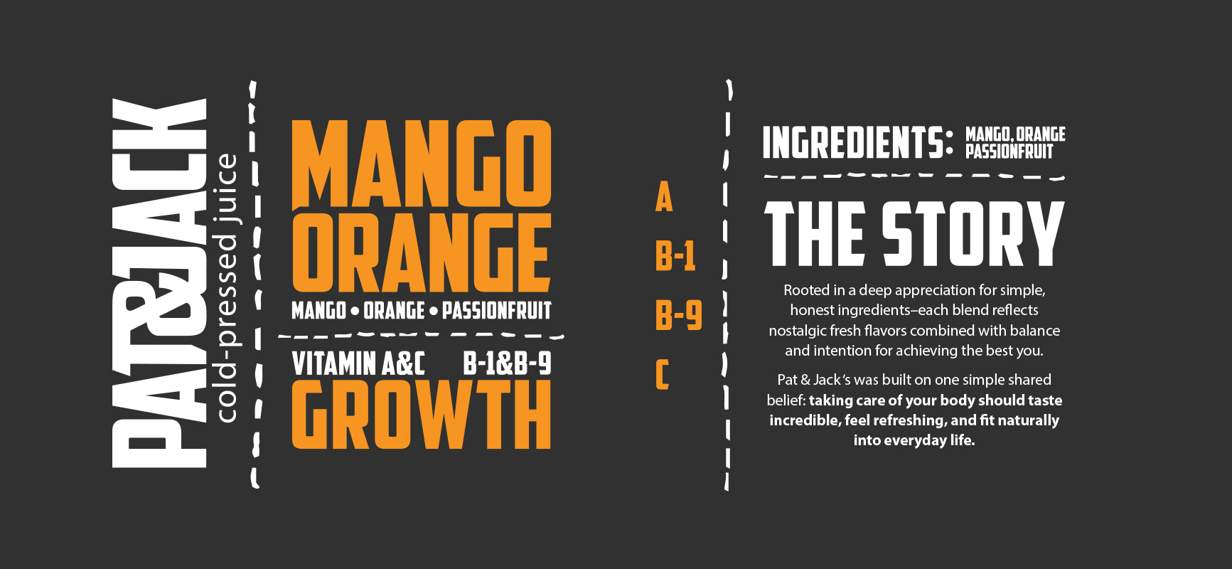
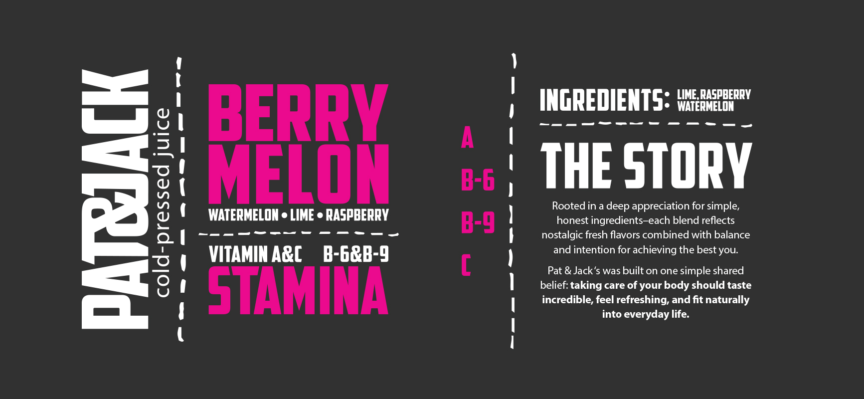
Rooted in a deep appreciation for simple, honest ingredients–each cold-pressed blend reflects nostalgic fresh flavors combined with balance and intention. Pat & Jack built their brand on one simple shared belief: taking care of your body should taste incredible, feel refreshing, and fit naturally into everyday life.
At the end of the day, every bottle is a story of where it all started–two friends chasing great flavors and putting health first.
Scroll down to see the original four delicious flavors:


ABOUT